Music Card Type
These cards feature a fully adjustable music timeline, media control buttons, and artwork. This is one of the more complex card types, featuring more than twenty available extra customizations.
This card type is used whenever card_type is specified as music or
spotify.
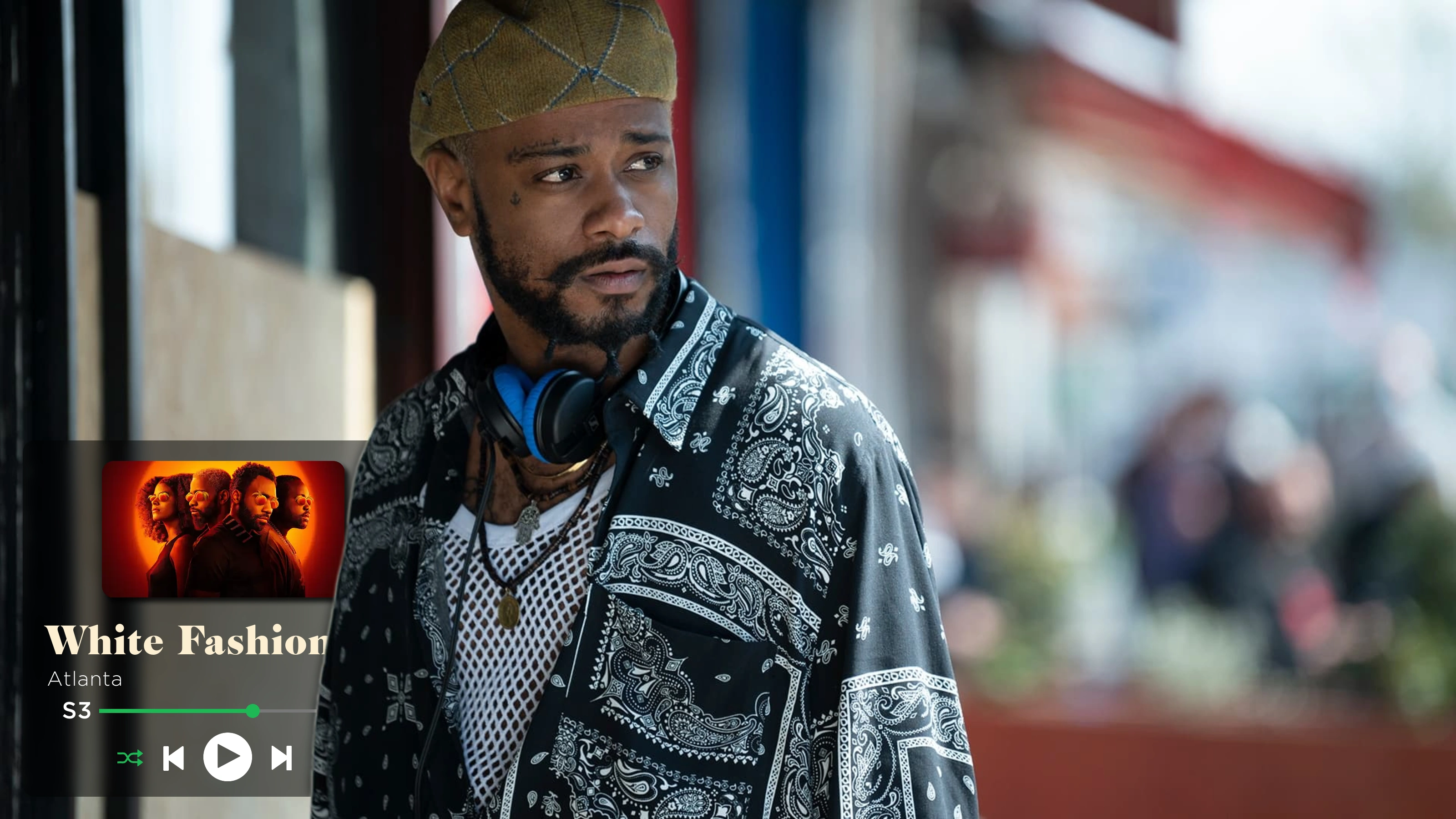
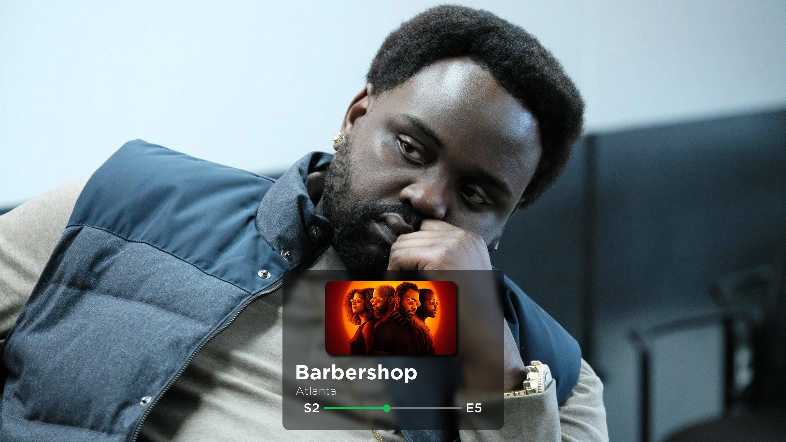
Example


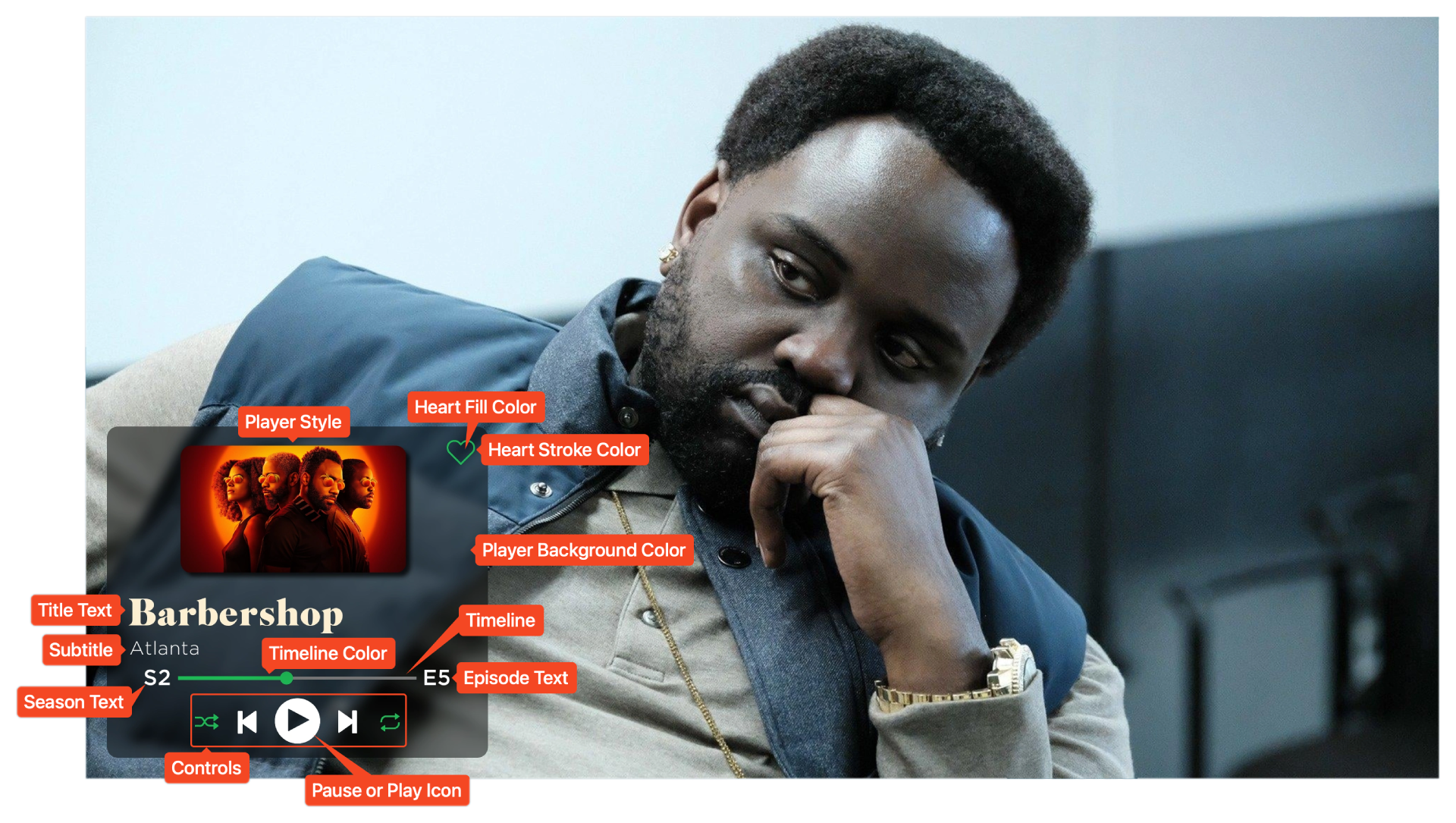
Labeled Card Elements
Valid extras
| Label | Default Value | Description |
|---|---|---|
add_controls |
false |
Whether to display the media controls |
album_cover |
- | File to use for the album image |
album_size |
1.0 |
Scalar for how much to scale the size of the album image |
control_colors |
white white white white white |
Color of the media control elements |
draw_heart |
false |
Whether to draw the heart |
episode_text_color |
Matches the font | Color to utilize for the episode text |
heart_color |
transparent |
Color to fill the heart with |
heart_stroke_color |
white |
Color to use for the outline of the heart |
pause_or_play |
play |
Which icon to display in the media controls |
percentage |
random |
Filled percentage of the timeline |
player_color |
rgba(0,0,0,0.50) |
Background of the player |
player_inset |
75 |
How far to inset the player from the edges |
player_position |
left |
Where to position the player on the image |
player_style |
logo |
Which style of the player to display |
player_width |
900 |
Width of the player |
round_corners |
true |
Whether to round the corners of the album image |
subtitle |
- | Text to display below the title |
timeline_color |
rgb(29,185,84) |
Color of the filled timeline |
Customization
Album Cover (album_cover)
If the card's Player Style is anything other than
basic, then the image to display above title text should be specified with the
album_cover extra.
This can be a file name - e.g. logo.png - in which case TCM will automatically
search alongside the specified source image for a file of that name.
Example
This can also be a fully specified file path.
Example
Player Style (player_style)
Above the title text, various kinds of "album art" can be added to the Card by
adjusting the player_style extra. This can be basic, artwork, logo, or
poster. The default value is logo.
Automatically Downloading Artwork
If the style is set to artwork, backdrops will not be automatically
downloaded. You will need to download these manually for the Series.


Controls
Enabling (add_controls)
Stylized music control icons / buttons can be added to the Card, if desired, by
setting the add_controls: true extra.
Coloring (control_colors)
If the music controls are enabled, then each
individual control icon can be recolored (or omitted completely) with the
control_colors extra.
This must be a set of five space-separated colors, where each color will be
used on the controls in order. The default value is
white white white white white.
Colors with Spaces
No specified colors can have spaces. For example, write rgb(1, 1, 1) as
rgb(1,1,1).
If a color is given as transparent or none, that control icon will be
removed.
Examples
series:
  Atlanta (2016):
    card_type: music
    extras:
      control_colors: rgb(29,185,84) none white none rgb(29,185,84)


Pause or Play Icon (pause_or_play)
The middle icon on the controls can be toggled between a pause and play icon
with the pause_or_play extra. This can be pause, play, or watched.
If set to watched, then the icon will match the watched status of the Episode.

Heart Icon
A small heart / like icon can also be added to the top right of the player. This icon can be toggled and recolored with extras.
Icon Overlap
TCM does not implement any logic to prevent the heart icon from overlapping album artwork or title text.
Enabling (draw_heart)
The heart icon is disabled by default, but can be enabled by setting
draw_heart: true.
Coloring (heart_color and heart_stroke_color)
The heart icon can be recolored in two ways. The edge / stroke of the icon with
the heart_stroke_color extra, and the inside / fill of the icon with the
heart_fill_color extra. These are separated so that the heart can be visible
while not appearing "selected."
Examples


series:
  Atlanta (2016):
    card_type: music
    extras:
      heart_color: "#FF2733"
      heart_stroke_color: "#FF2733"

Timeline
Coloring (timeline_color)
The color of the filled portion of the timeline can be adjusted with the
timeline_color extra. This only applies to the filled portion - e.g. the
percentage - and the "bubble".

Filled Percentage (percentage)
The filled logic for the timeline is customizable with the percentage extra.
If this is set to an explicit number - such as 0.3 - then the timeline
will always be that percent filled. The number will be interpreted as a
percentage between 0.0 and 1.0.
If this is specified as random (or left as the default) then each Card will
utilize a random fill percentage.
Player Position
Overall Position (player_position)
The position of the player can be adjusted by setting player_position to
either left, middle or right. The default value is left.
Example

Inset (player_inset)
The player_inset extra allows more fine-tuned control of how far from the edge
of the image to place the player. This is applied to both the horizontal and
vertical spacing. The defalut value is 75, but can be any value between
0 and 1200.

Player Width (player_width)
The width of the player can also be adjusted with the player_width extra. All
elements within the player - notably the timeline and any album artwork - are
dynamically resized with the specified width. The default value is 900,
but can be any value between 400 and 3000.

Player Color (player_color)
The background color of the player can be adjusted with the player_color
extra. The default value is rgba(0,0,0,0.50).

Subtitle Text (subtitle)
The text below the title is referred to as the subtitle. This text can be
edited via the subtitle extra.
If omitted, then the subtitle will not be displayed at all, or it can be included in a template to dynamically add to each series.

Album Image Corner Rounding (round_corners)
To add to the "album art" aesthetic, the corners of images are rounded when the
Player Style is set to artwork or poster.
This can be disabled by setting round_corners: false.

Mask Images
This card also natively supports mask images. Like all mask images, TCM will automatically search for alongside the input Source Image in the Series' source directory, and apply this atop all other Card effects.
Example